
The three pie charts below show the changes in annual spending by a particular UK school in 1981, 1991 and 2001.
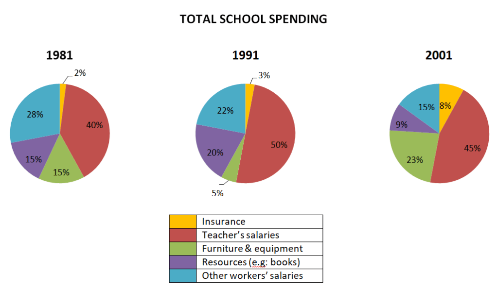
The pie charts illustrate changes in a UK’s school expenditure further categorized into teachers’ salaries, furniture and equipment, resources, insurance and other workers’ salaries in 3 particular years mainly 1981, 1991 and 2001.
Read full essay HERE.


Leave a comment